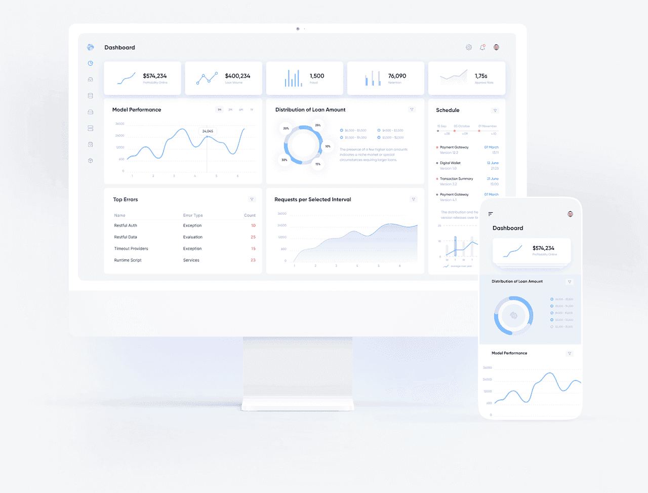
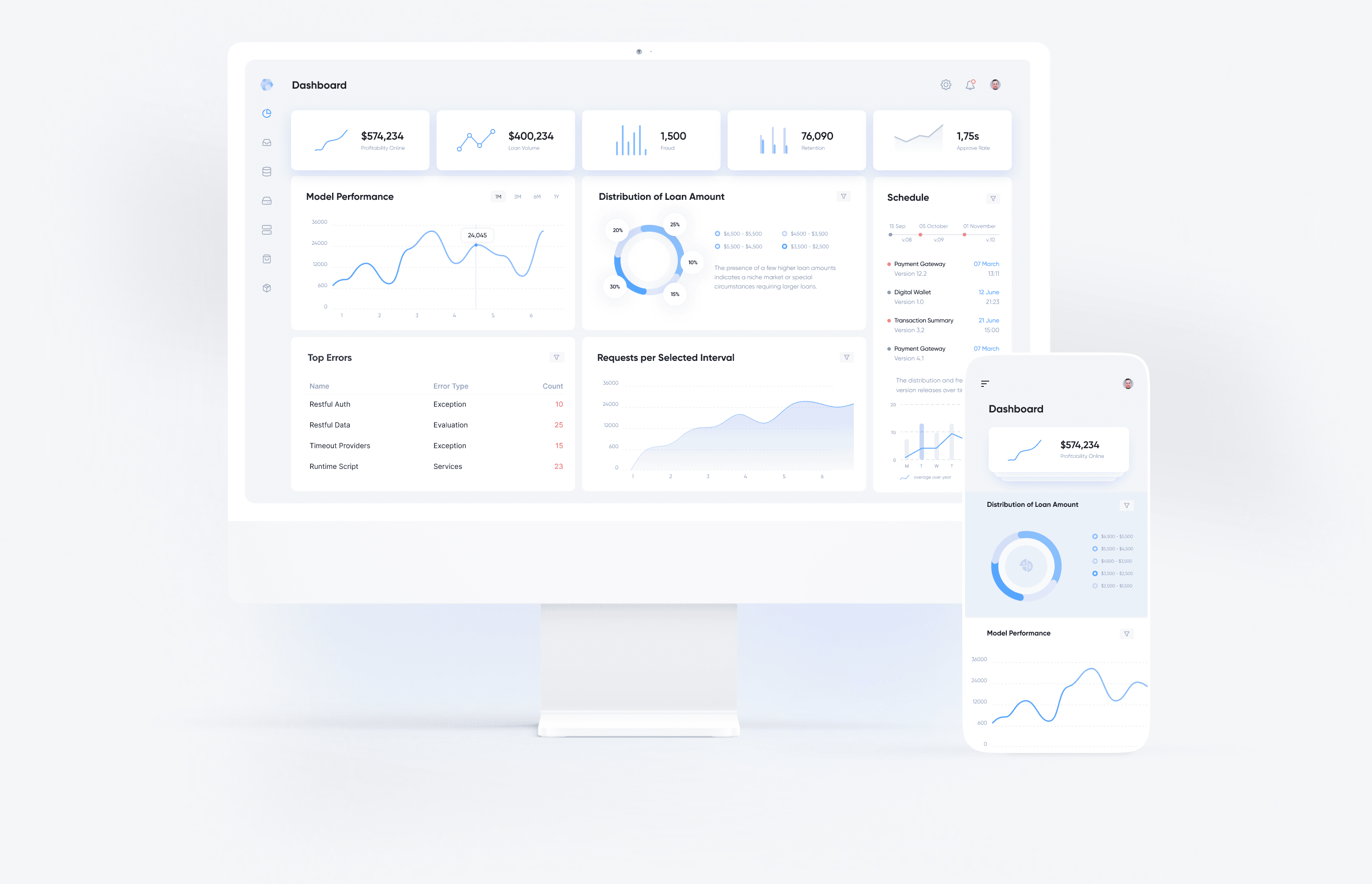
Multi-Brand Design System
Design Systems · Figma Variables
One component library now powers every brand variant — no duplicated files, no drift between client instances.
A token architecture and component library that lets one design system power every brand variant — colors, surfaces, typography, and semantic roles switch automatically through Figma Variables modes.
(Challenge)
Building for multi-brand products requires more than changing colors. Without clear token architecture, teams quickly face duplicated components, broken consistency, and expensive maintenance.
(Approach)
I separated raw values, brand identity, semantic roles, and component behavior into clear token layers — Scale, Identity, Role, and Components — using Figma Variables with multi-mode support so the same component library switches visual identity through token modes instead of being rebuilt per client.
(Results)
Brand launch time
Design maintenance
Component reuse
Development handoff
Cross-brand consistency
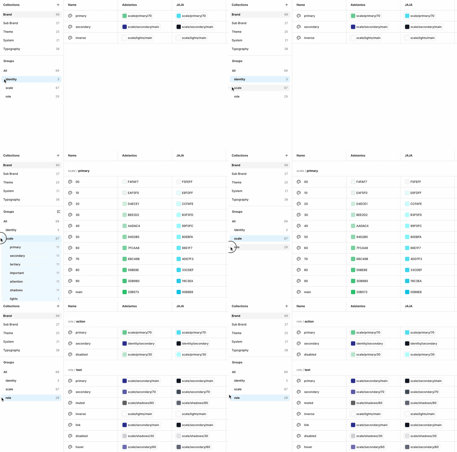


(03)
(Deep Dive)
© 2026
Design Challenge
Token Architecture
Variables Setup
Semantic Role Tokens
Multi-Brand Mode Switching
Real Product Application
Technical Workflow