Challenge
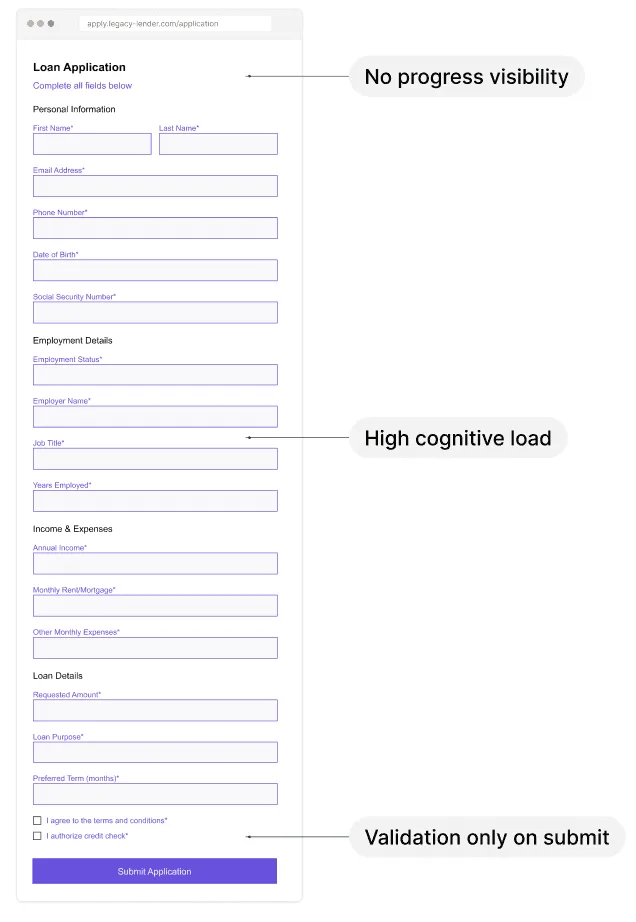
The original onboarding flow was presented as a long single-page form with multiple financial and verification fields shown at once. Behavioral analytics revealed a major drop-off once users reached income-related and verification steps.
Behavioral Analytics Investigation
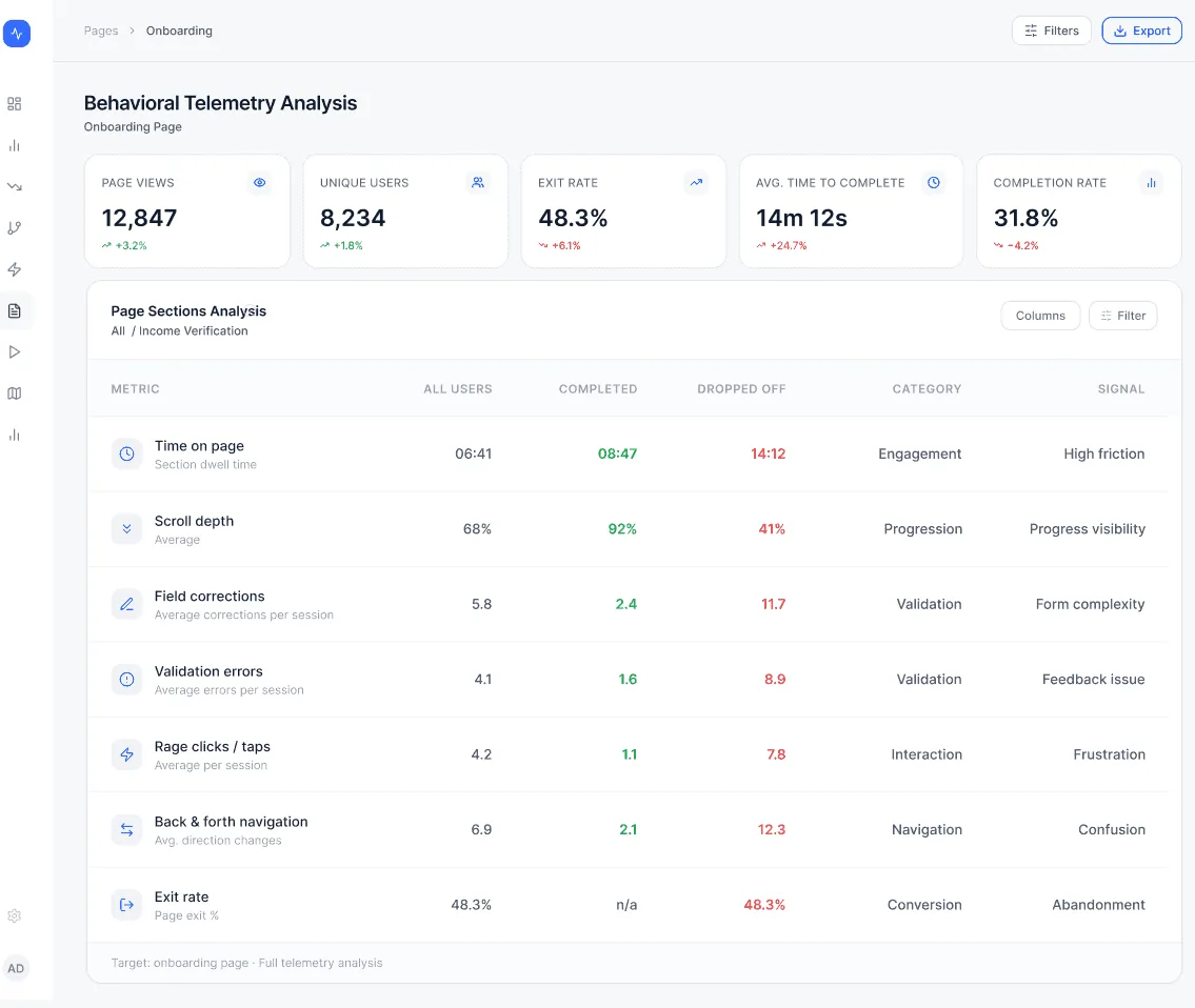
Goal: understand where users experience friction and identify the primary causes of abandonment before redesigning the onboarding flow. I analyzed behavioral telemetry across onboarding sections, comparing engagement, validation activity, navigation patterns, and abandonment rates. Key findings: exit rate reached 48.7% in Income Verification — the highest of any section — with 8.9 validation errors, 11.7 field corrections, and 12.3 back-navigation actions per session. Primary insight: users weren’t abandoning the application from lack of intent — they were struggling to understand, validate, and correct income-related information.
Funnel Drop-Off Root Cause Investigation
Comparing users who completed onboarding with those who dropped off revealed consistent patterns: drop-off users spent significantly more time in the section, validation errors increased dramatically, field corrections were substantially higher, and back navigation occurred more frequently. Funnel: 100% started the application, 82% reached Income Verification, 54% passed it, and only 32% completed the application. Root cause identified: behavioral patterns indicated confusion, delayed feedback, and excessive effort required to complete income-related tasks — not a lack of intent.
Root Cause Analysis
Primary friction points: too much information presented at once, no visible sense of progress, delayed validation feedback, no ability to save progress and continue later. Supporting observations: repeated scrolling behavior, hesitation during verification steps, backward navigation before submission — all pointing to cognitive overload and unclear feedback in the original single-page form.
Product Hypothesis
Breaking the long onboarding form into guided steps could reduce cognitive load, improve progress visibility, and help users complete the application with fewer errors. Earlier validation feedback and visible progress indicators were expected to reduce back navigation, lower abandonment during verification, and improve overall completion rates. Success criteria: increase completion rate, reduce validation-related drop-off, reduce time to complete, reduce back navigation, improve progression between steps.
Design Principles
The redesign was guided by four principles: reduce cognitive load through progressive disclosure, increase transparency through visible progress indicators, provide feedback earlier through inline validation, and support interrupted journeys with progress recovery.
Guided Multi-Step Flow
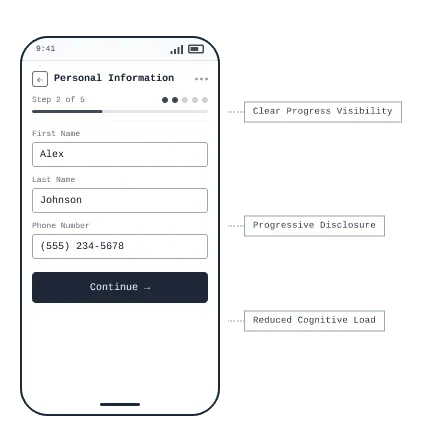
Problem: users were required to process too much information at once, creating cognitive overload and increasing abandonment risk. Design principle: reduce cognitive load. The form was broken into manageable steps, presenting only the information required at the current stage, and progressively disclosing additional information as users move through the journey.
Application Progress
Goal: help users understand where they are in the process, what has been completed, and what happens next. A step indicator and progress bar communicate current position clearly. A time estimate and reassurance note reduce perceived effort and anxiety. The current step is highlighted, removing ambiguity, and a prominent CTA paired with a remaining-steps preview encourages forward momentum.
Early Validation
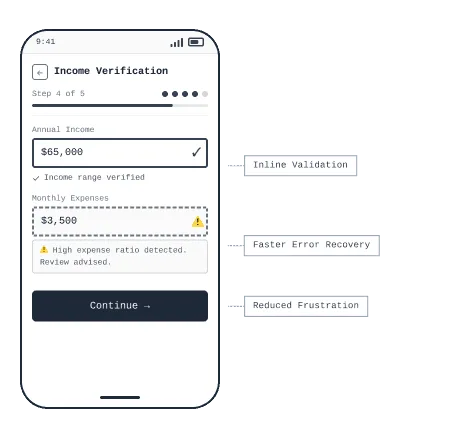
Problem: validation feedback previously only appeared after submission. Design principle: provide earlier feedback. Inline validation now surfaces issues the moment they occur, letting users correct information immediately instead of discovering errors at the end of a long form.
Smart Guidance
Problem: users struggled to understand financial terminology and required information. Embedding help inline at the point of need removes the need to recall definitions mid-task. An on-demand expandable help card lets users resolve uncertainty without leaving the screen. Concrete income examples remove ambiguity about what counts, reducing downstream validation errors.
Save Progress
Problem: users were abandoning the application before completion. Design principle: support flexible completion. The flow now allows people to pause the application and return later without losing progress, reducing abandonment caused by interruptions or incomplete sessions.
What Happens Next
Problem: users were uncertain about what information would be requested later. Showing the full step sequence upfront removes surprise and reduces cognitive uncertainty. An informational note explains why income data is needed, converting anxiety into informed consent. A time estimate alongside a clear CTA reduces hesitation and improves forward momentum.
Application Summary
Problem: users frequently navigated backward to verify previously entered information. A single review screen displays all entered data, eliminating the need to move backward through steps. Inline edit links per section allow targeted corrections without restarting the flow. Seeing a complete summary before submission gives users the reassurance needed to commit — reducing drop-off at the final step.
Outcome
Guided onboarding, earlier validation, and visible progress lifted funnel completion by 53% and cut time-to-complete by 35% — turning a single, overwhelming form into a flow users could actually finish.